SetOut iOS App
2023 / 07 / 24
Motivation
When I'm out holidaying or travelling through new cities, I love building a daily itinerary that touches upon diverse activities and intriguing sights. The fusion of Google/Apple Maps and local tourist maps is my go-to method for itinerary creation. However, the process isn't always smooth sailing. Though sketching out routes in my mind isn't too time-consuming, the frequent switch between apps and physical maps can make it a bit monotonous.
The Problem
Both Google Maps and Apple Maps are great when you have a specific destination in mind. However, their utility is somewhat limited when you find yourself in a new location, searching for a standout site to explore. At one point I even considered using AllTrails, but its focus skews towards outdoor adventures and hiking trails, rather than iconic tourist attractions.
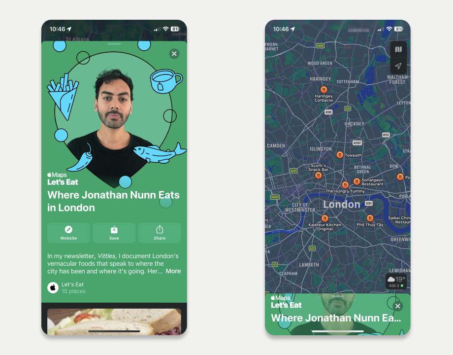
1. Apple Guides is a great feature, but it's hard to filter by content type.
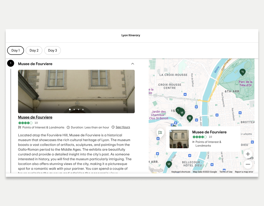
2. Tripadvisor's new Itinerary feature is showing a lot of promise and is something that I'll keep an eye on.
Apple Maps introduced the "Guides" feature, an excellent feature, but it does come with a caveat. These guides are user-generated and while Apple Maps highlights all of the locations mentioned, the responsibility of weaving together an itinerary ultimately falls on the user.
Just recently Tripadvisor added an itinerary generating tool which comes remarkably close to what I had envisioned for SetOut. So far, it looks like a solid feature that will likely earn a regular spot in my travel toolkit.
SetOut
The idea behind the app was to allow users to build an itinerary for urban exploration, based on their preferences. Whether that's the distance they are willing to travel, or the amount of free time they have available, I wanted the app to build the perfect itinerary in just a few taps.
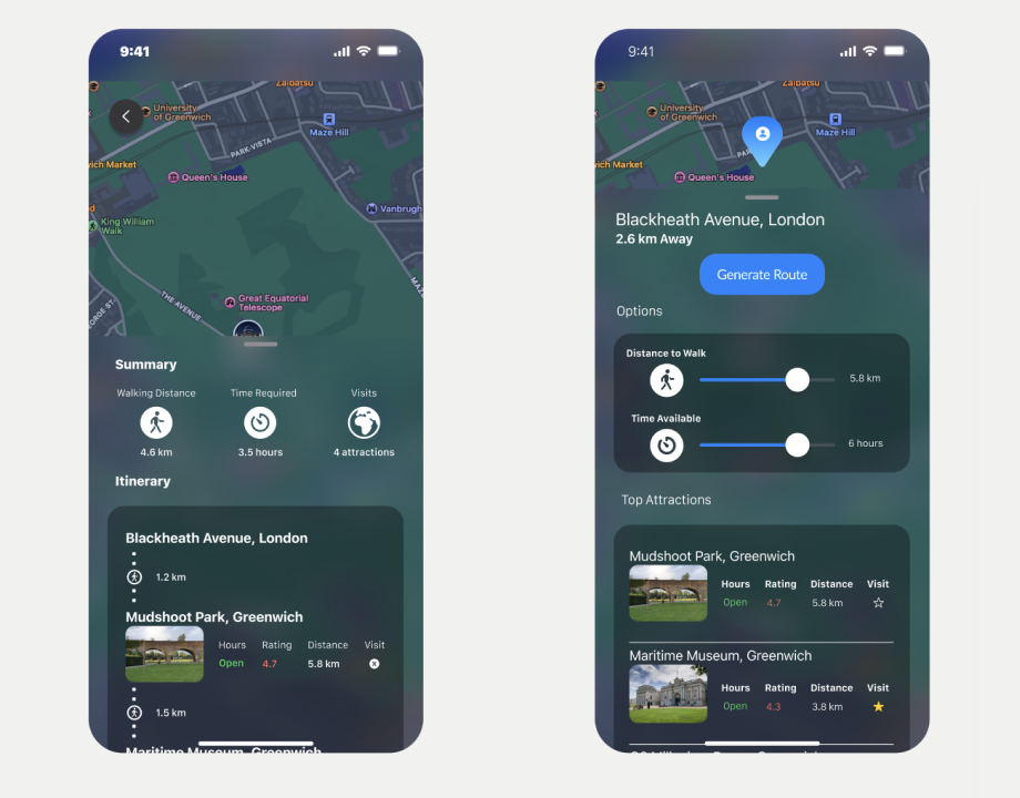
3. The original design was more of a rough sketch and the app used dark mode.
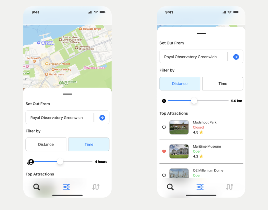
4. The final design was cleaner and used fewer frosted glass effects.
To reduce the scope as much as possible, I settled on building the app for iOS only and treat it as a proof of concept, rather than a shippable product. When designing the app, I focused on creating only three main screens:
1. Location search, where users can set the starting point of their trip.
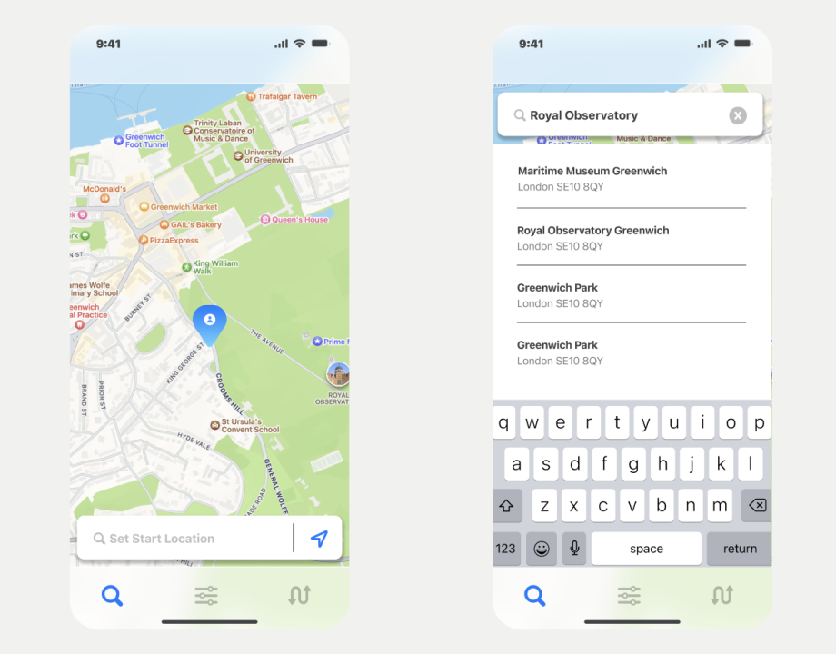
5. The Search View in Figma. Originally the search bar was supposed to be at the bottom.
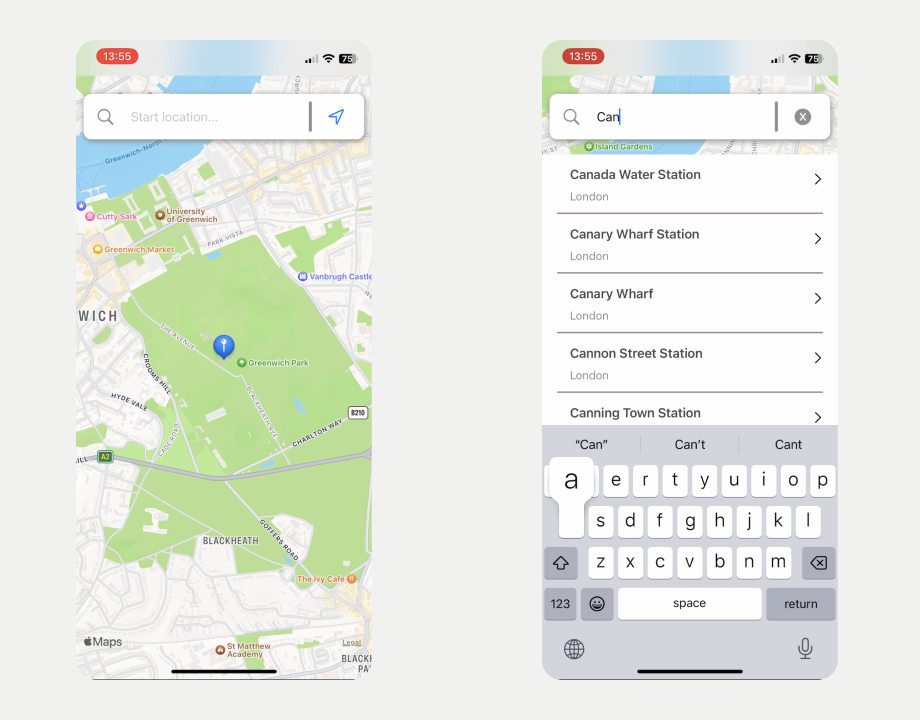
6. The Search View in the iOS app. The search bar position moved to the top, since it felt more comfortable to use.
2. Options, where itinerary parameters, such as "time available" and "distance travelled" can be defined.
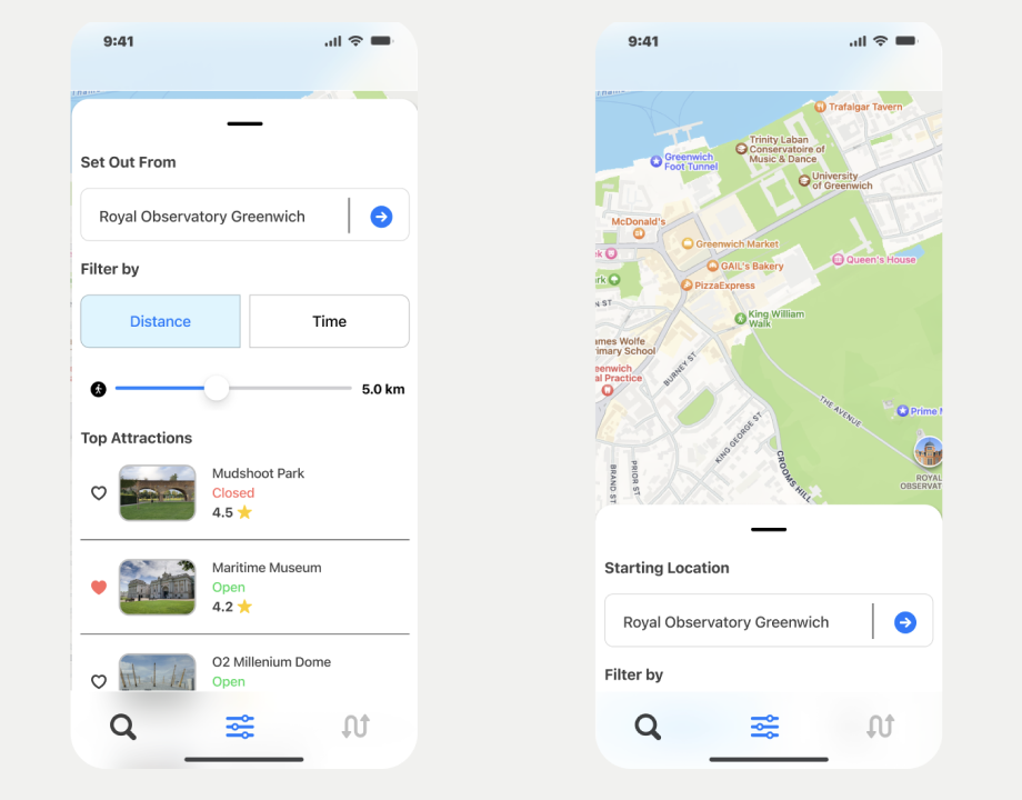
7. The Options View in Figma. The larger location images looked great during the design phase, but limited usability due to the size of the scrollable area.
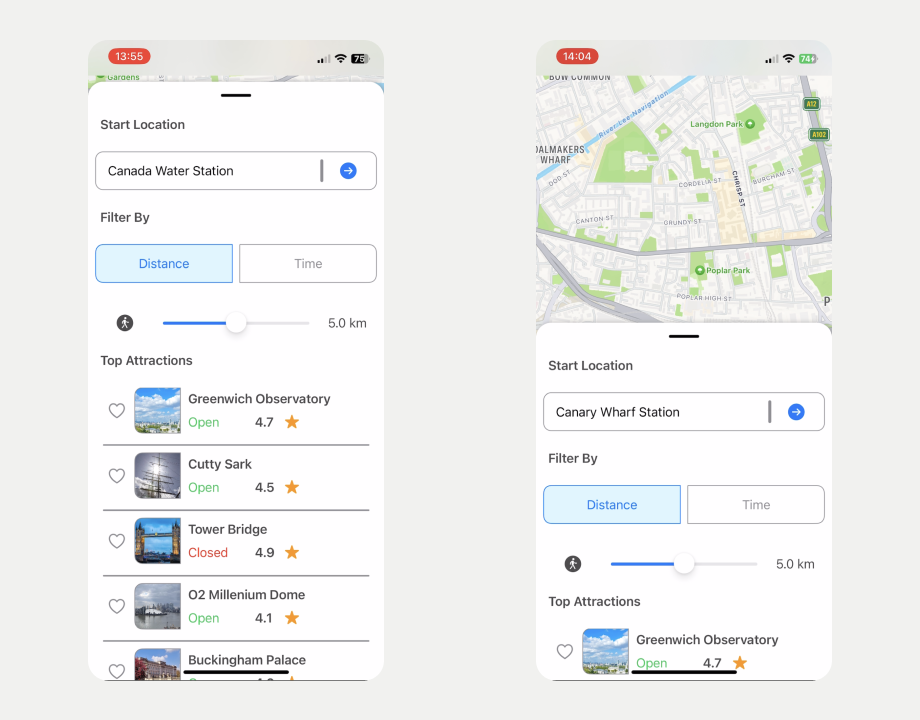
8. The Search View in the iOS app. The size of the Top Attractions rows meant that in practice users would only see three at once. Reducing the size fixed this issue.
3. Itinerary, where the generated route can be displayed.
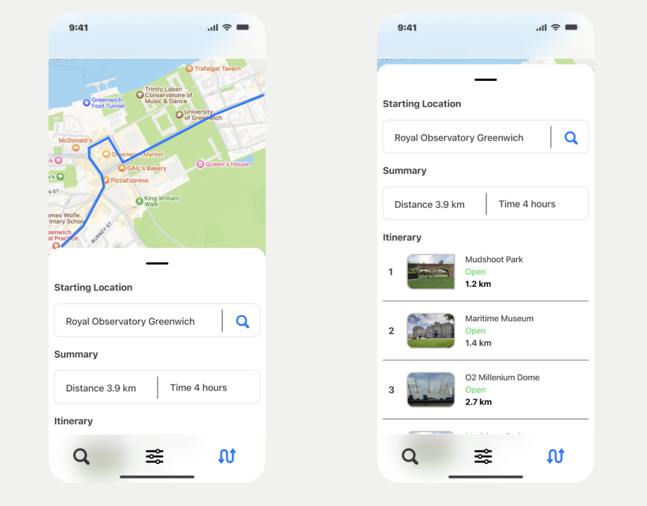
9. The Itinerary View in Figma. The main challenge was to provide the user with a meaningful summary and show the generated itinerary in a clear way.
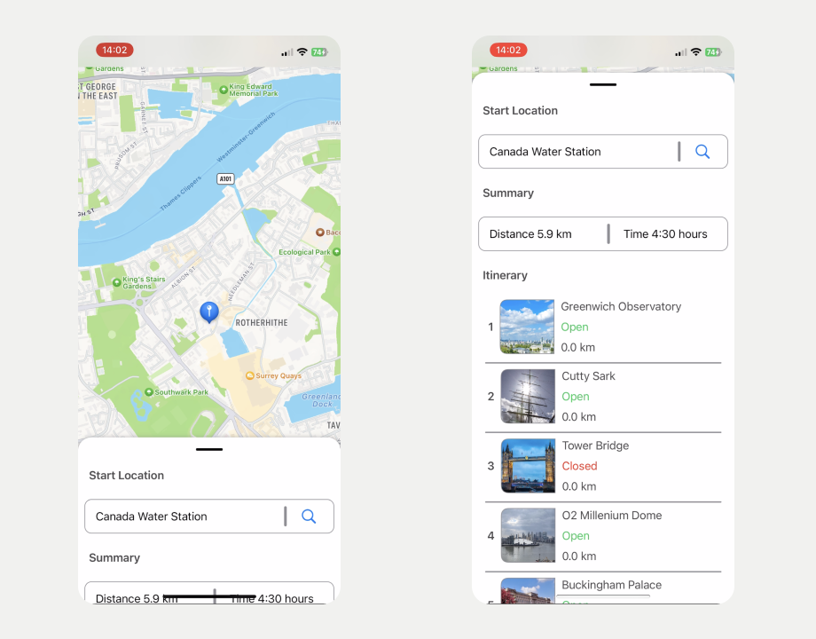
10. The Search View in the iOS app. The final version ended up very close to the original design, with some changes to the layout.
For the designs I used Figma, while for the client app I used SwiftUI. To make the transition from Figma to code easier, I stuck exclusively to the SF symbols and fonts. It was my first time using SwiftUI, so there was definitely a bit of a learning curve. Swift as a programming language is fantastic, but SwiftUI as a framework is still lacking features. The Apple Maps app was a huge inspiration when it comes to layout and view transitions. If anything I came away from this experience really appreciating all the small details that the Apple Maps team has put into their app.
When I started prototyping the app I decided to target iOS16, so I can take advantage of the massive changes that Apple introduced to the SwiftUI navigation API. Despite my best efforts, however, I couldn't get the view navigation to work how I wanted it. In hindsight that was mainly my fault, but originally I wanted to embed all of my main views into a single sliding card component. SwiftUI's navigation API really didn't agree with that approach, so I ended up building my own navigation stack.
Later I reworked the design, so each main view had it's own sliding card, instead of a shared one. If I had rebuild it with SwiftUI's navigation API, things would have clicked perfectly with the new design, but I decided against doing a massive refactor.
Outcome and Lessons Learned
Overall I really enjoyed building the client app. If I want to target iOS only again in the future, I'd definitely go with SwiftUI. I certainly made things harder for myself, by opting for custom view navigation. That caused a few headaches when server calls got involved and managing state become more complex.
Speaking of state, I also ended up using environment objects (@StateObject) more than I should have. While these environment objects were largely read-only, there were a few cases where the change in state triggered unexpected view updates, which could have resulted in undefined behaviour when rendering the view.
In the end I decided to leave the app as a POC, mainly due to time constraints and because I didn’t think the app would add a lot of value to users. The original scope was too narrow (I had only collated tourist attractions located in London) and I quickly realised that if I wanted to offer a curated list of places to visit, I couldn't rely on pulling the location data from Apple Maps, but instead had to build it myself. That is until I started playing around with tools such as OpenAi's GPT4. It turns out LLM's are pretty good at building simple itineraries or highlighting top attractions in an area to visit. That could simplify the back end significantly, by asking the model to provide an itinerary, given a set of parameters, and then using Apple Maps' server API to build the route between points of interest, instead of keeping a curated list of locations and using shortest path algorithms to generate a route.
In my next blog post I'll go into the design and implementation of the back end server.


